Altair Visualisation EDA of OkCupid Data
As part of the Masters of Data Science syllabus, we had to pick up Altair as part of our Visualisation toolkit for the Python language. For my personal dataset choice, I decided to perform EDA on OkCupid’s dataset on the user database.
1. OkCupid Dataset
The dataset can be found in R as part of a library package. All the data variables were obtained from OkCupid’s platform using their user profiles. Although the data was obtained from the OkCupid platform, names were removed to eliminate any direct form of identification. The dataset was also cleaned up by Albert Kim and Adriana Escobedo-Land, and subsequently entered into the Journal of Statistics Education 2015 for a Statistics and Data Science introductory course. It is currently available on CRAN as a R package (“okcupiddata”). The dataset package can be found in the following: (https://cran.rstudio.com/web/packages/okcupiddata/index.html).
This dataset was collated based on 59,946 users in June 26 2012 who met the following criteria:
- Living within 25 miles of San Francisco.
- Active profiles as of June 26 2012
- Were online in the previous year
- Had at least one picture in their profile
The dataset comprises of 22 variables in total that describe their user’s profile:
1. age: Age of the user as of June 2012
2. body_type: Self-rated body type based on OkCupid’s platform options.
3. diet: Diet type based on OkCupid’s platform options.
4. drinks: Drinking habits of user
5. drugs: Drug habits of user
6. education: Highest education attained by user
7. ethnicity: Ethnicity declaration input by user
8. height: Height in inches
9. income: Annual income
10. job: Current job
11. last_online: Last session of log-in by user on OkCupid platform
12. location: Location of residence
13. offspring: Number of children based on OkCupid’s platform options.
14. orientation: Sexual orientation based on OkCupid’s platform options.
15. pets: Preference and ownership of cats and/or dogs. Based on OkCupid’s platform options.
16. religion: Religious affiliation based on OkCupid’s platform options
17. sex: Gender
18. sign: Astrological signs based on OkCupid’s platform options
19. smokes: Smoking habits based on OkCupid’s platform options
20. speaks: Languages spoken by user
21. status: Relationship status
22. essay0: Response to first essay question (my self summary), trimmed to 140 characters.
2. OkCupid Dataset EDA
Let’s take a look at some of features with Altair, Pandas and numpy loaded. Since Altair has a default parameter that prevents you from working with larger datasets, we have to turn off that parameter by disabling the max rows default.
import pandas as pd
import altair as alt
import numpy as np

alt.data_transformers.disable_max_rows()
The gender breakdown comprises of 35,829 males and 24,117 females.
alt.Chart(data).mark_bar().encode(
    y = alt.Y("sex:N"),
    x = alt.X("count(sex):Q", title = "Number of users"),
    color = alt.X("sex:N")
).properties(title = "Gender breakdown", height = 100)

What is more interesting to me is also the topic of sexual orientation. 51,606 users identify as straight, 5,573 users identify as gay, and 2,767 identify as bisexual.
alt.Chart(data).mark_bar().encode(
    x = alt.X("orientation:N"),
    y = alt.Y("count(orientation):Q", title = "Number of users"),
    color = alt.X("orientation:N")
).properties(title = "Sexual orientation breakdown")

The number of users who identify as bisexuals are the lowest, and is about half the size of users who identify themselves as gay. Let’s take a look at the sexual orientation breakdown by gender.
alt.Chart(data).mark_bar().encode(
    x = alt.X("orientation:N"),
    y = alt.Y("count(orientation):Q", title = "Number of users"),
    color = alt.X("orientation:N")
).facet(
    facet = "sex:N",
    columns = 2
).properties(title = "Sexual orientation breakdown by Gender")

An interesting phenomenon is shown: there are more women who identify as bisexuals than women who identify as gays, while the reverse is true for men. Also to note, roughly about 1 in 6 women (roughly 4000 to 24,000 total women) identify as either bisexuals or gays, while for men, the ratio is about 1 in 7 (roughly 5000 to 35,000 total men).
Perhaps women are in general more sexually liberal in that sense, while men are more fixated on the stereotypes that is enforced by society. The backlash of identifying as non-straight is probably less for women compared to men in a patriarchal sociey. Granted, this data was from 2012 and the user population was from San Francisco. A lot of time has passed since then, and the frontiers of gender norms have changed drastically especially with the advent of LGBTQ and also with drag becoming mainstream.
The age breakdown is shown as below:
alt.Chart(data).mark_bar().encode(
    x = alt.X("age:Q"),
    y = alt.Y("count(age):Q")
).properties(title = "Age breakdown", height = 200)
The lowest age is 18 years old while the oldest age is actually 110 years (which is probably an outlier). The mean age is around 32.3 years old. As shown, most of the users are roughly between 20 to 40, with about one-third/one-fourth ranging beyond 40 years old.
Out of the 60,000 users, only 11,504 declared their incomes. Thus, the following breakdown represents a sample of the population and might not be truly representative.
alt.Chart(data).mark_bar().encode( x = alt.X(“income:Q”), y = alt.Y(“count(income):Q”) ).properties(title = “Income breakdown”, height = 200)

Research Questions
As part of the visualisation lab, we have to explore either a Descriptive or an Exploratory type of research question. To put things into some perspective:
- Descriptive research questions seek to provide a summary of the dataset. No interpretation of the results are required since it is geared towards a particular summary statistic.
- Exploratory research questions are those that provide an initial analysis for any patterns, trends or relationships. These questions can be viewed as a “primer” for more indepth hypothetical research questions.
My objectives in this exercise are to answer the following research questions:
- What is the age distribution of men and women on OkCupid? (Descriptive)
- Do people who identify as Agnostic/Atheist have a higher tendency to drink compared to those who identify with a religion affiliation? (Exploratory)
In Altair, it is not particularly easy to create plots related to density/ridgeline/violin plots compared to the ggplot package in R. Thus, my motivations for this lab actually stems from trying to learn the density/ridgeline plots, especially for the Descriptive research question. I also wanted to familiarise myself with using direct data transformation within Altair.
Descriptive Challenge: What is the age distribution of men and women on OkCupid?
Note that for this visualisation, I intended to create two sub-visualisations. For both charts, binning of the data was required. As part of my learning objectives, I approached it from either:
- data wrangling via Pandas before using
Altairto plot - Using
Altairto perform wrangling/transformation before plotting
Below is my wrangling code with respect to Pandas before using Altair to create a visualisation.
# Filter out users whose age is greater than 90 as they are outliers

data = data.query("age < 90")

# Dropping all common rows with NA
data_gender_age = data[["sex","age"]].dropna()

# Renaming "sex" column observations
data_gender_age["sex"] = np.select(
    [
        data_gender_age["sex"] == "m",
        data_gender_age["sex"] == "f"
    ],
    [
        "Male", "Female"
    ],
default = "0")

# Create necessary bins
bins = [10, 15, 20, 25, 30, 35, 40, 45, 50, 55, 60, 65, 70, 75, 80]
bin_labels = [15, 20, 25, 30, 35, 40, 45, 50, 55, 60, 65, 70, 75, 80]
data_gender_age["bin"] = pd.cut(data_gender_age["age"], bins = bins)

# Relabelling bins for graph reference labelling
data_gender_age["bin_label"] = data_gender_age["bin"].map(lambda x: str(x.left) + " - " + str(x.right))

# Find the lower range of bin for plotting
data_gender_age["bin"] = data_gender_age["bin"].map(lambda x: x.left)
With the necessary data wrangling/processing completed, we can use Altair to create the visualisation. My target visualisation comprises of:
- A population pyramid plot for each gender
- Overlayed density plots of each gender for comparison
Below is the code for the population pyramid plot:
base = alt.Chart(data_gender_age).transform_aggregate(
    value = "count()", groupby=["sex", "bin_label"]
)

color_scale = alt.Scale(domain=['Female', 'Male'],
                        scheme = "accent")

left = base.transform_filter(
    alt.datum.sex == "Female"
).encode(
    y = alt.Y("bin_label:O", axis = None),
    x = alt.X("value:Q", title = "No of users",
             sort = alt.SortOrder("descending"),
             scale = alt.Scale(domain = [0,12000])),
    color = alt.Color("sex:N",
                     legend = None,
                      scale = color_scale
                     )
).mark_bar().properties(title = "Female")

middle = base.encode(
    y = alt.Y("bin_label:O", axis = None),
    text = alt.Text( "bin_label:O")
).mark_text().properties(width = 20)

right = base.transform_filter(
    alt.datum.sex == "Male"
).encode(
    y = alt.Y("bin_label:O", axis = None),
    x = alt.X("value:Q", title = "No of users",
             scale = alt.Scale(domain = [0,12000])),
    color = alt.Color("sex:N",
                     legend = None,
                    scale = color_scale
                     )
).mark_bar().properties(title = "Male")

pyramid_plot = alt.concat(left, middle, right, spacing = 5).properties(
title = "User distribution across age and gender")
Note that we can save the Altair Chart object as a variable. This is useful for multiple plots concatenation.
Up next is the code for creating the density plot. In this approach to create binned data, I utilised Altair’s data transformation functions. This is actually much harder to perform because there is no actual “feedback” of how the transformed data looks like. Based on my limited experience with Altair so far, I don’t think it is possible to extract out the transformed data, and thus, you need to be very strong conceptually in terms of the transformation steps required if you use Altair’s transformation.
As part of my learning and future reference, I have embedded comments to illustrate/describe what each transformation is for. Hopefully this guides any user trying to learn the data transformation techniques of Altair.
density_plot = alt.Chart(data_gender_age).transform_bin(
    # Creates 2 extra columns in df for further grouping: bin_min and bin_max
    # Adjust "step" argument to increase bin sizing
    # Downstream calculations will refer to new col "bin_min" for plotting encoding reference
    ["bin_min", "bin_max"], "age", bin = alt.Bin(step = 1)
).transform_aggregate(
    # *Aggregate: Calculate counts by gender & binned intervals (bin_min, bin_max). New col "value" created
    # Aggregate allows for the equivalent of group_by & mutate in R
    value = "count()", groupby = ["sex", "bin_min", "bin_max"]
).transform_joinaggregate(
    # *JoinAggregate: Creates new column of calculated sum counts based on grouped gender
    # Use of JoinAggregate to keep data column "value" while creating aggregated summary column "total_counts_gender"
    total_counts_gender = "sum(value)", groupby = ["sex"]
).transform_calculate(
    # Performs normalisation calculation by dividing counts by total counts in gender, converted to percentage
    # Note use of expression "datum" in transform_calculate
    # Create new col "percent_counts"
    percent_counts = "datum.value/datum.total_counts_gender *100"
).transform_window(
    # Smoothing transformation of "percent_counts"
    # Need to sort all data using col "bin_min" first
    sort = [{"field":"bin_min"}],
    # Create rolling window for aggregation operations. [-1,1] refers to 1 observation before and after
    frame = [-1,1],
    # Create new col "smoothed_percentage" to calculate based on rolling window
    smoothed_percentage = "mean(percent_counts)",
    # Based on grouping variable gender
    groupby = ["sex"]
).mark_area(
    interpolate = "monotone",
    fillOpacity = 0.5,
    stroke = "black"
).encode(
    # X reference to new col "bin_min"
    alt.X("bin_min:Q", title = "Age"),

    # Y reference to new col "smoothed_percentage"
    alt.Y("smoothed_percentage:Q", title = "Percentage (%)"),
    alt.Color("sex:N", scale = alt.Scale(scheme = "accent"), title = None)

    # In-graph "faceting" using Rows
    #alt.Row("sex:N", title = None, header = alt.Header(labelAngle = 0))
).properties(
    title = "Density distribution of age across both genders",
    height = 200, width = 850
)
After creating both intermediary Chart objects pyramid_plot and density_plot, we can use Altair’s concatenation to orientate the sub-plots and create a combined visualisation.
Note that the “&” operator is used here to indicate a vertical concatenation. For horizontal concatenation, you can use the “|” operator.
- This is to be distinguished from the “+” operator, which adds plot layers on top of each other on the same Chart (which is similar to the concept used in
ggplot).
As shown in the following code, we can configure the particular parameters of the overall concatenated plot.
(pyramid_plot & density_plot).configure_title(
    anchor = "middle"
    ).configure_legend(
    title = None
    )
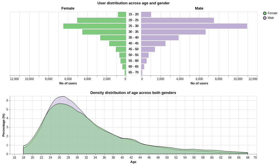
The population pyramid plot gives a good visual sense of the absolute users by gender, which depicts that there tends to be less women than men on OkCupid. To put things into perspective, the overlayed density plots provide a calibrated basis for fair comparison.
Based on my 1st research question, there are generally less women than men on the OkCupid platform. However, the normalised age distribution across both genders are largely the same. One minor difference is that for men, there seems to be a higher concentration of males between the age range of 24 to 34 compared to women (6.5% versus 5.5%). On the other hand, we can observe a higher percentage of older women in the older age bins (beyond age 48) compared to men.
Exploratory Challenge: Do people who identify as Agnostic/Atheist have a higher tendency to drink compared to those who identify with a religion affiliation?
For the purpose of this research question, we need to understand the related data, namely:
- Drinking Habits
- Religion
For Drinking Habits, the different types of listed user habits are as listed:
- “socially”,
- “often”,
- “not at all”,
- “rarely”,
- “very often”,
- “desperately”,
- with the remaining as NA.
As shown, the drinking options are treated as somewhat Ordinal data, with some semblance of a progressive scale in terms of drinking tendencies.
For Religion, there are a total of 46 types of religion affliation options, which are comprised of a combination of:
- Religion types (Atheism, Agnosticism, Judaism, Hinduism, Buddhism, Islamism, Catholicism)
- Strength of beliefs (very serious, somewhat serious, not too serious, laughing about it)
For this research question, we will ignore the strength of beliefs, and simplify users according to their core religion affliation types.
Below is the data wrangling code:
# Religion impact on drinking
data_religion_drinks = data[["religion","drinks"]].dropna()

data_religion_drinks.head()

# Classify if atheist/agnostic
data_religion_drinks["agnostic_atheist"] = np.where(data_religion_drinks["religion"].str.contains("agnost|athei"), "Agnostic/Atheist", "Religion-Affliated")


# Renormalising data
# Performing count of data based on two tiered grouping
data_religion_drinks_group_count = data_religion_drinks.groupby(["agnostic_atheist","drinks"]).size().reset_index()

# Renaming column as the last col name was rendered "0" with reset_index
data_religion_drinks_group_count.columns = ["agnostic_atheist", "drinks", "counts"]

# Normalising to get percentages based on 1 tiered groupby on "agnostic_atheist"
data_religion_drinks_group_count["percentages"] = data_religion_drinks_group_count.groupby("agnostic_atheist")["counts"].apply(lambda x: x/sum(x) * 100)

# Relabeling "drinks" to Camel case for visualisation
data_religion_drinks_group_count["drinks"] = np.select(
    [
        data_religion_drinks_group_count["drinks"] == "not at all",
        data_religion_drinks_group_count["drinks"] == "rarely",
        data_religion_drinks_group_count["drinks"] == "socially",
        data_religion_drinks_group_count["drinks"] == "often",
        data_religion_drinks_group_count["drinks"] == "very often",
        data_religion_drinks_group_count["drinks"] == "desperately"
    ],
    [
        "Not At All", "Rarely", "Socially", "Often", "Very Often", "Desperately"
    ],
default = "0")
To plot ordinal data, in R ggplot, one needs to consider the factor levels of the grouped data. In Altair, one needs to employ a similar technique as well. Besides the requirement to treat the x-axis data as Ordinal, I also had to create a separate column for the “drinks_ordering” based on my semantics understanding of drinking habits, which will be used as reference in the Altair Chart. For more details, refer to the Altair plotting code.
# Drinks level ordering
data_religion_drinks_group_count["drinks_ordering"] = np.select(
    [
        data_religion_drinks_group_count["drinks"] == "Not At All",
        data_religion_drinks_group_count["drinks"] == "Rarely",
        data_religion_drinks_group_count["drinks"] == "Socially",
        data_religion_drinks_group_count["drinks"] == "Often",
        data_religion_drinks_group_count["drinks"] == "Very Often",
        data_religion_drinks_group_count["drinks"] == "Desperately"
    ],
    [
        1, 2, 3, 4, 5, 6
    ],
default = "0")
Now that the data-wrangling is done, let’s move on to the actual plotting.
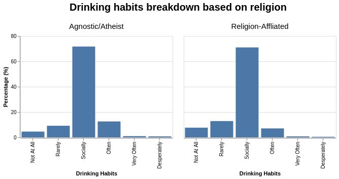
alt.Chart(data_religion_drinks_group_count).mark_bar().encode(
    x = alt.X("drinks:O", title = "Drinking Habits",
              # With reference to drinks_ordering column
              sort=alt.EncodingSortField(field='drinks_ordering', op="mean", order='ascending')),
    y = alt.Y("percentages", title = "Percentage (%)")
).properties(
    width = 300,
    height = 200,
).facet(
    column = alt.X("agnostic_atheist:N",
                  title = "Drinking habits breakdown based on religion"),
).configure_header(
    titleFontSize = 20,
    labelFontSize = 15
)
Given that drinking habits are on a spectrum and somewhat on a dichotomous scale, I will try to classify them into the following major groups:
- High tendency: “Often”, “Very Often”, “Desperately”
- Low tendency: “Not at all”, “Rarely”, “Socially”
# Create new column for "binary" classification of drinking tendencies
data_religion_drinks_group_count["drinking_tendency"] = np.select(
    [
        data_religion_drinks_group_count["drinks"] == "Not At All",
        data_religion_drinks_group_count["drinks"] == "Rarely",
        data_religion_drinks_group_count["drinks"] == "Socially",
        data_religion_drinks_group_count["drinks"] == "Often",
        data_religion_drinks_group_count["drinks"] == "Very Often",
        data_religion_drinks_group_count["drinks"] == "Desperately"
    ],
    [
        "Low", "Low", "Low", "High", "High", "High",
    ])
alt.Chart(data_religion_drinks_group_count).mark_bar().encode(
    x = alt.X("drinks:O", title = "Drinking Habits",
              # With reference to drinks_ordering column
              sort=alt.EncodingSortField(field='drinks_ordering', op="mean", order='ascending')),
    y = alt.Y("percentages", title = "Percentage (%)"),
    color = alt.Color("drinking_tendency:N", title = "Drinking Tendencies")
).properties(
    width = 400,
    height = 200,
).facet(
    column = alt.X("agnostic_atheist:N",
                   title = "Drinking habits breakdown based on religion"),
).configure_header(
    titleFontSize = 20,
    labelFontSize = 15
)
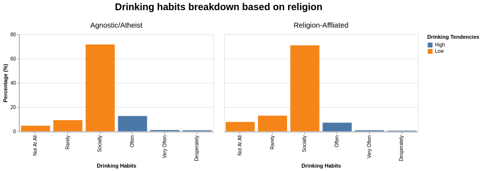
Even with the change of colour scheme, it is still insufficient to answer the research question. To take things perhaps even further, we can make some strong assumptions and visually depict the counts of High and Low tendencies of drinking into a binary answer.
final_data_religion_drinks_group_count = data_religion_drinks_group_count.groupby(["agnostic_atheist", "drinking_tendency"]).sum().reset_index()
alt.Chart(final_data_religion_drinks_group_count).mark_bar().encode(
    x = alt.X("drinking_tendency:O", title = "Drinking Tendencies"),
              # With reference to drinks_ordering column
              # sort=alt.EncodingSortField(field='drinks_ordering', op="mean", order='ascending')),
    y = alt.Y("percentages", title = "Percentage (%)"),
    color = alt.Color("drinking_tendency", title = "Drinking Tendencies")
).properties(
    width = 200,
    height = 300,
).facet(
    column = alt.X("agnostic_atheist:N",
                   title = "Drinking habits breakdown based on religion"),
).configure_header(
    titleFontSize = 20,
    labelFontSize = 15
)
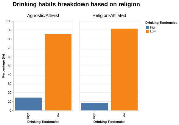
Based on my 2nd research question, the users’ selection options for drinking habits are ordinal, but based on the semantics used in the options, we can classify them into Lower and Higher Drinking tendencies. Also for reiteration, the comparison is among Non-religious users (Atheist, Agnostics) versus Religious users (Buddhism, Islamism, Catholicism, etc).
With the aggregation of drinking habits options, it allows us to see that users with a core religion affiliation tend to drink less.
From the graph, the percentage of “social” drinking remained roughly the same. On the other hand, the main difference in drinking habits between the religious versus non-religious users arise from:
- an increase in “Not at all” and “Rarely” options for religious users,
- a decrease in “Often” options for non-religious users.
At this point, we can probably speculate/attribute the reduction in drinking habits for religious users could be due to certain religious beliefs, where sometimes drinking alcohol can be seen as irresponsible or even hedonistic behaviour.
Personal Learning Objectives
Based on this exercise, I managed to achieve some of my personal learning goals that I set for myself:
- Familiarising myself with
Altair’s data transformation functions - Learning the steps for creating a density plot
- Learning how to present ordinal data in an ordered fashion through a sorting variable.
- It is better to perform direct data transformation on your dataframe before sending it to
Altairfor plotting.