Causal Impact Analysis of a Public Health Emergency on PM 2.5 Air in LA during COVID-19
With the recent COVID-19 pandemic, the implementation of quarantine and social distancing by various governments created a ripple of effects that affect cities all around the world. The key driver behind this was the halting of economic activity which brought about a big crunch in the global economy. In the early phase of the COVID-19 pandemic, the media reported that the carbon emissions in China was reduced drastically in mid Feb 2020. This gave me an idea as I wanted to try out some time series analysis on air quality in certain cities with the implementation of a city-wide quarantine measure.
In this article, I will be assessing the air quality of Los Angeles and the impact of the measures taken as part of the public health emergency declared in LA County with relation to COVID-19. The article will also dive into the R code that was used in the analysis with the bsts and CausalImpact packages. The following points frame my analysis:
- The type of air quality used for this analysis is the PM2.5, which stands for atmospheric particulate matter with a diameter of less than 2.5 micrometers.
- The implementation of the public health emergency will be perceived as an “intervention”. The date of this intervention will be explained in more detail.
- Los Angeles was chosen because it is such an iconic city that is typically bustling with activity. It is also known for its traffic congestion which I postulate to be a contributing factor to the PM 2.5 levels.
- The air quality data will be aggregated by calendar weeks.
Data Sources
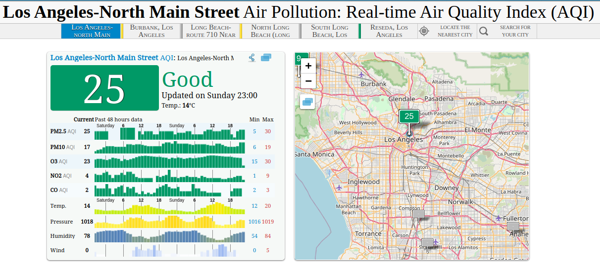
The data for this was taken from The World Air Quality Project. The particular data measurement point is at North Main Street, which is pretty central within Los Angeles.
The World Air Quality Project works with the following sources:
- South Coast Air Quality Management district (AQMD)
- Air Now (US EPA)
- California Air Resources Board (CARB)
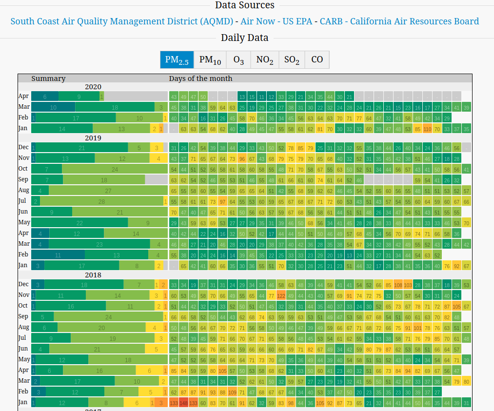
As shown in the following screenshot, you get to pick the different air quality types. I chose PM2.5 primarily because the values were nominally higher compared to the others, which allows for us to capture a reduction in air quality. The heatmap below shows the daily observations of the data with “cool” colours (like blue or green) representing lower values while hot colours (like yellow or red) representing high values. In addition, we also observe greyed out boxes which represent missing data.
EDA and Data Analysis
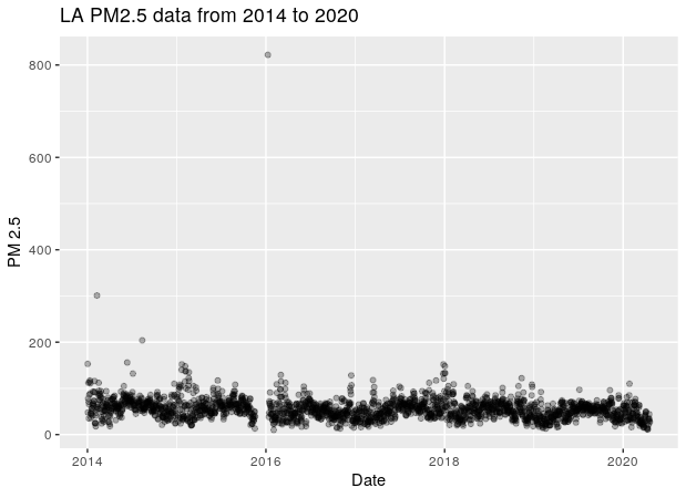
At the point of this analysis, the data I downloaded was from Jan 2014 to 19th April 2020. A simple plot reveals a glaring outlier in Jan 2016 is extremely high of 800 in value which is unlikely. In addition to that, there is also a missing chunk of data leading up to the outlier.
Corroborating that with the heatmap chart, we observe that:
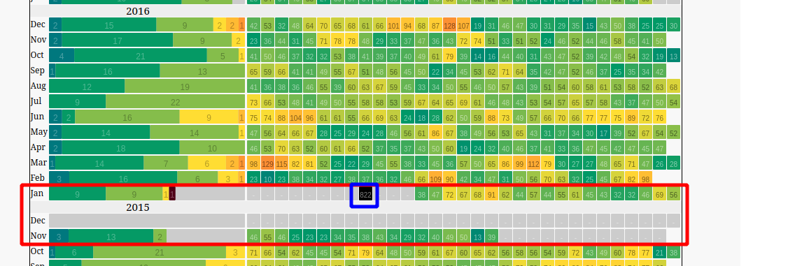
- There is missing data from the second half of November 2015 to mid Jan 2016 (shown by the red rectangle)
- The outlier data has a value of 822, and occurred in the midst of the missing data period.
Based on that, it seems that perhaps the measurement instrument might have had a prolonged failure/outage which resulted in 2 months worth of missing data. Any attempts for data imputation is highly questionable as the extended period of missing data makes it hard to determine the basis for imputation.
For the purpose of the analysis, I decided to trim down the data to mid Jan 2016. At the same time, I will be aggregating the data on a weekly basis which is an intentional choice that allows me not to perform any unnecessary imputation of the missing data.
Intervention Timing
Based on my research of Los Angeles news search, a public health emergency was declared in LA County over the coronavirus on the Wednesday March 4th 2020.
Taking that into account, the aggregation by calendar week basis produced a plot which shows a stable time series withe occasional fluctations.
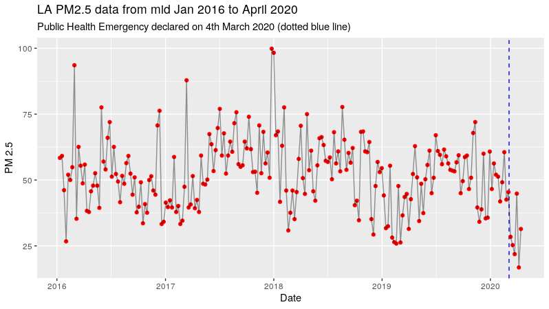
In this analysis, the impact of the declared public health emergency is perceived as an intervention. With the intention to slow the spread of the virus, the government mandated several measures such as social distancing, travel bans, closure of non-essential services. This drastically reduced economic activity, which can be seen as a form. Not only are the measures a sudden change, they are implemented for a prolonged period, which makes the quarantine initiative an interesting candidate for a causal analysis.
Based on the data, we do see a sharp reduction in terms of the weekly PM2.5 data. However, we can’t conclude that the reduction is statistically significant. This brings us to the next step of time series analysis using structural time series analysis.
Structural Time Series Modelling
Using both CausalImpact and bsts packages, we can utilise the models of structural time series to create a counterfactual baseline as a projection of what would have happened if the intervention event did not occur.
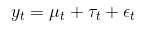
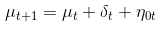
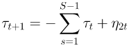
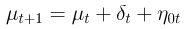
We can first model the time series of the PM2.5 data using the structure time series. The model assumes the following state components:
- Observed states y
- Hidden state or level component μ
- Trend drift component δ
- Seasonal component τ
As observed, this model is only a univariate series with no exogenous factors. To improve the modelling of the series, one can utilise exogenous factors with the “spike and slab” feature selection process that comes with the bsts package. However, in view that we are pursuing a causal analysis of an intervention variable that has wide spread effects, it is difficult to find unaffected exogenous variables that will help enhance the prediction of the counterfactual baseline. Thus, I will not pursue the additional modelling of exogenous variables.
In terms of modelling choices, I explored 4 models that were a combination of 2 by 2 factors:
-
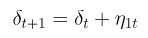
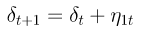
Trend Drift Component δ:
-
Local linear trend
The local linear trend has a local level equation that has a trend component δ that is a random walk. This trend model has high volatility which provides flexibility that is useful for adapting to local variations, but may not be as useful for long term forecasting.
-
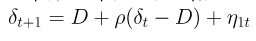
Semi local linear trend
The alternate trend model is a semi local linear trend that is kind of a hybrid that is between a random walk and stationary. As shown in the structural equation, the trend component has a D parameter, which represents the long-term slope component that δt will revert to. Short term stochastic deviations from D will be determined by the weight parameter ρ.
-
-
Seasonal component τ:
-
Only 52-week seasonal trend
It is natural to include a seasonal component that captures the dependency of week according to the 52 week seasonality. To do that, we have to assume that all years have 52 weeks, which is an approximation.
-
52-week seasonal trend and Quasi-Monthly Trend
Aside from the 52-week seasonality, I also considered the notion of Quasi-Monthly effects. In this case, I assumed that a month comprises of 4 weeks, which gives us approximately 13 months.
-
Below is a short summary of the 4 models explored in this article:
- Model 1: Local linear trend, 52-week seasonal trend
- Model 2: Local linear trend, 52-week and Quasi-Monthly trend
- Model 3: Semi local linear trend, 52-week seasonal trend
- Model 4: Semi local linear trend, 52-week and Quasi-Monthly trend
BSTS Models with Code
Before we proceed, the criteria for model selection should be defined clearly. Using the 4 models, I will explore their cumulative 1 step forward prediction error for the time series between the start to the time of intervention. The reason why we stop at the point of the intervention is to ensure that we do not let the intervention results contaminate the pre-intervention period modelling. To do that, we will populate all data after the intervention event with NAs.
# Post Intervention Period is filled with NA
dat_pm25_wk_causal <- dat_pm25_wk %>%
  mutate(pm25 = replace(pm25, week >= as.Date("2020-03-04"), NA))

# Create ts zoo data
ts_pm25_wk <- zoo(dat_pm25_wk_causal$pm25, dat_pm25_wk_causal$week)
With the data set edited with NA for the post intervention period, let’s take a look at the different models. The modelling process can be broken down into the following:
- Initiate model specifications object with an empty list.
- Add a trend component (local linear or semi local linear)
- Add a 52-weekly seasonal component (and Quasi-monthly if required)
- Create a
bstsmodel with total of 1500 MCMC samplings but with 500 burn-in steps.
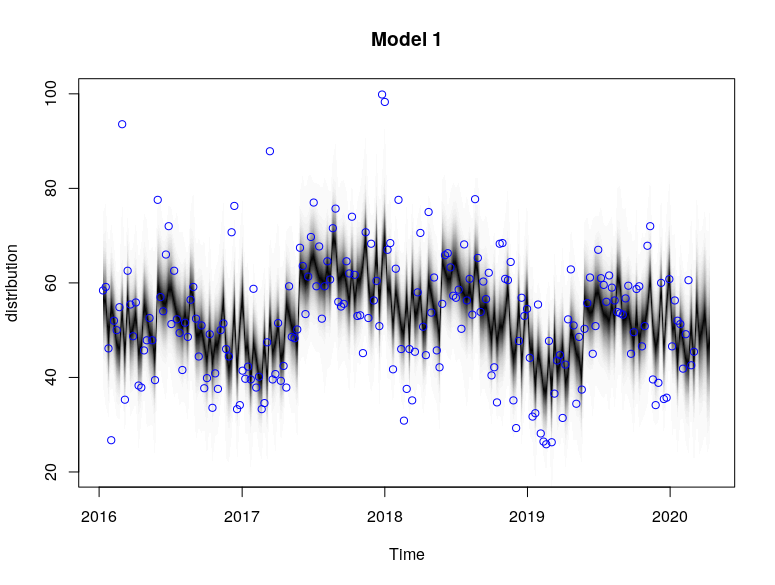
# Model 1
ss <- list()
# Local trend, weekly-seasonal
ss <- AddLocalLinearTrend(ss, ts_pm25_wk)
# Add weekly seasonal
ss <- AddSeasonal(ss, ts_pm25_wk, nseasons = 52)
model1 <- bsts(ts_pm25_wk,
state.specification = ss,
niter = 1500,
burn = 500)
plot(model1, main = "Model 1")
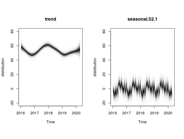
plot(model1, "components")
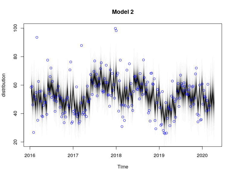
# Model 2
ss2 <- list()
# Local trend, weekly-seasonal, monthly-seasonal
ss2 <- AddLocalLinearTrend(ss2, ts_pm25_wk)
# Add weekly seasonal
ss2 <- AddSeasonal(ss2, ts_pm25_wk, nseasons = 52)
# Add monthly seasonal
ss2 <- AddSeasonal(ss2, ts_pm25_wk, nseasons = 13, season.duration = 4)
model2 <- bsts(ts_pm25_wk,
state.specification = ss2,
niter = 1500,
burn = 500)
plot(model2, main = "Model 2")
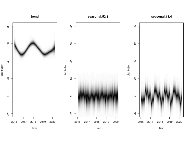
plot(model2, "components")
# Model 3
ss3 <- list()
# Semi Local trend, weekly-seasonal
ss3 <- AddSemilocalLinearTrend(ss3, ts_pm25_wk)
# Add weekly seasonal
ss3 <- AddSeasonal(ss3, ts_pm25_wk, nseasons = 52)
model3 <- bsts(ts_pm25_wk,
state.specification = ss3,
niter = 1500,
burn = 500)
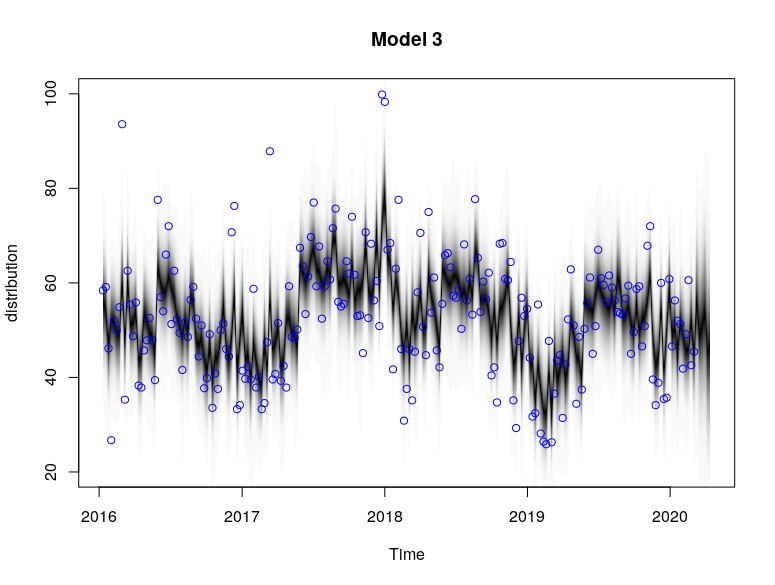
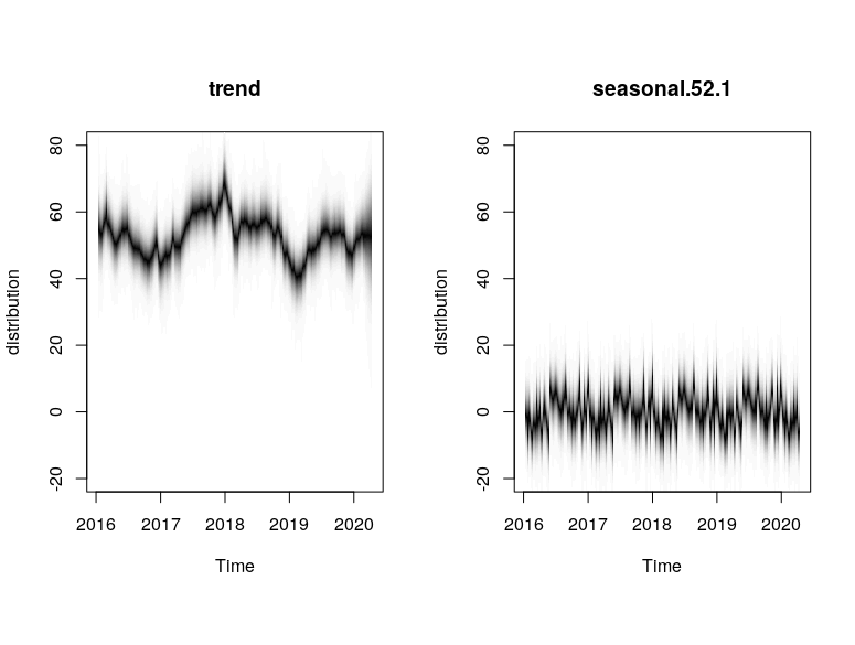
plot(model3, main = "Model 3")
plot(model3, "components")
# Model 4
ss4 <- list()
# Semi Local trend, weekly-seasonal, monthly-seasonal
ss4 <- AddSemilocalLinearTrend(ss4, ts_pm25_wk)
# Add weekly seasonal
ss4 <- AddSeasonal(ss4, ts_pm25_wk, nseasons = 52)
# Add monthly seasonal
ss4 <- AddSeasonal(ss4, ts_pm25_wk, nseasons = 13, season.duration = 4)
model4 <- bsts(ts_pm25_wk,
state.specification = ss4,
niter = 1500,
burn = 500)
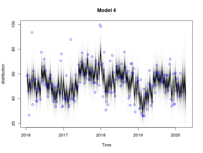
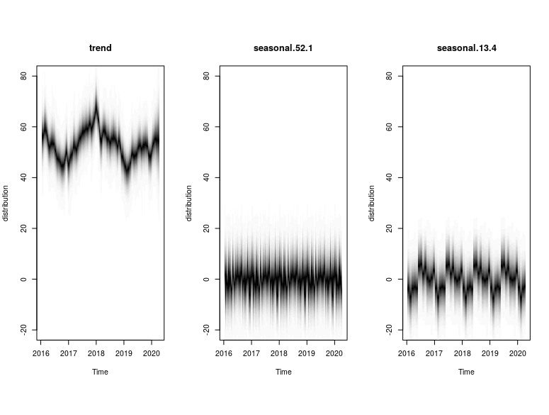
plot(model4, main = "Model 4")
plot(model4, "components")
The plots provide the MCMC sampling of the structural time series given the observed data. The extent of shading reflects the posterior probability of the time series path under multiple simulations.
Based on the models, we see that the local linear trend was much smoother compared to the semi local linear trend. This could be due to the fact that the drift component in the semi local linear trend comprised of more variables (D, ρ) that allowed for more extreme stochasticity. This allowed for the semi-local linear trend models to capture certain high spike points such as in Jan 2018 that were not captured by the trends in the local linear trend models.
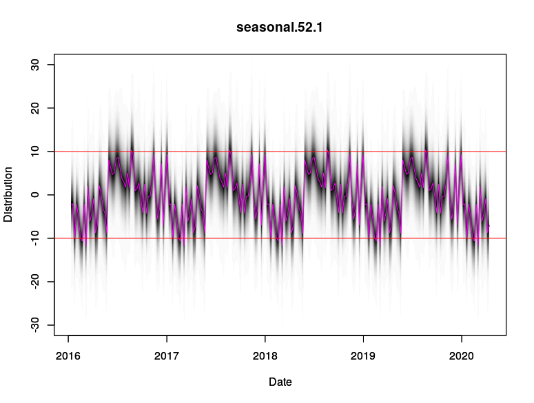
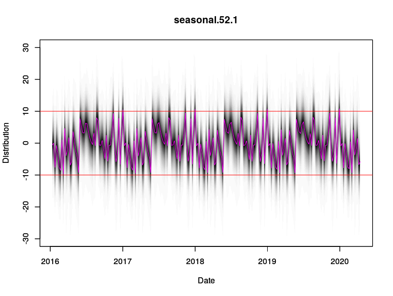
This is also manifested in the difference in the seasonal components between Model 1 and Model 3. Model 1 (local linear) attributes more of the high-deviation spikes to the 52 weekly seasonal component, but Model 3 (semi local linear) attributes those high-deviation spikes to be more of a trend stochasticity. As such, the seasonality pattern in Model 3 is more “compact” around its mean value compared to Model 1.
# Compare seasonal component of model 1 and model 3
# Model 1
plot(model1$state.specification[[2]], model1,ylim = c(-30,30),
     ylab = "Distribution", xlab = "Date")
par(new=TRUE)
plot(components1$Date, components1$Seasonality, col = "magenta", type = "l", ylim = c(-30,30),
     ylab = "Distribution", xlab = "Date")
abline(h = 10, col = "red")
abline(h = -10, col = "red")

# Model 3
plot(model3$state.specification[[2]], model3,ylim = c(-30,30),
     ylab = "Distribution", xlab = "Date")
par(new=TRUE)
plot(components3$Date, components3$Seasonality, col = "magenta", type = "l", ylim = c(-30,30),
     ylab = "Distribution", xlab = "Date")
abline(h = 10, col = "red")
abline(h = -10, col = "red")
Using the cumulative absolute error of 1 step prediction forward prediction of the different models, we see that Model 3 (dotted blue) is the best model as it has the lowest cumulative error while Model 2 (dashed red) has the highest cumulative error.
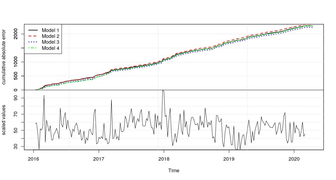
Based on that, we will use Model 3 to generate the counterfactual baseline for the Causal Analysis in the next section. At the same time, it is worth mentioning that the extra “Quasi-Monthly” seasonality (present in Models 2 and 4) was not incrementally useful compared to the base 52-weekly seasonality (present in Models 1 and 3) which was sufficient.
Causal Analysis of Public Health Emergencies Measures on PM 2.5 Air
The CausalImpact package allows us to use the custom BSTS model which we created, but we have to feed in the data response after the intervention period. An additional argument alpha can be specified to estimate the posterior intervals (which is 1 - alpha).
# Obtain post period data
dat_pm25_wk_causal_post <- dat_pm25_wk %>%
  filter(week >= as.Date("2020-03-04"))

# Use model 3 for causal impact
impact <- CausalImpact(bsts.model = model3,
                       post.period.response = dat_pm25_wk_causal_post$pm25, alpha = 0.05)
plot(impact)
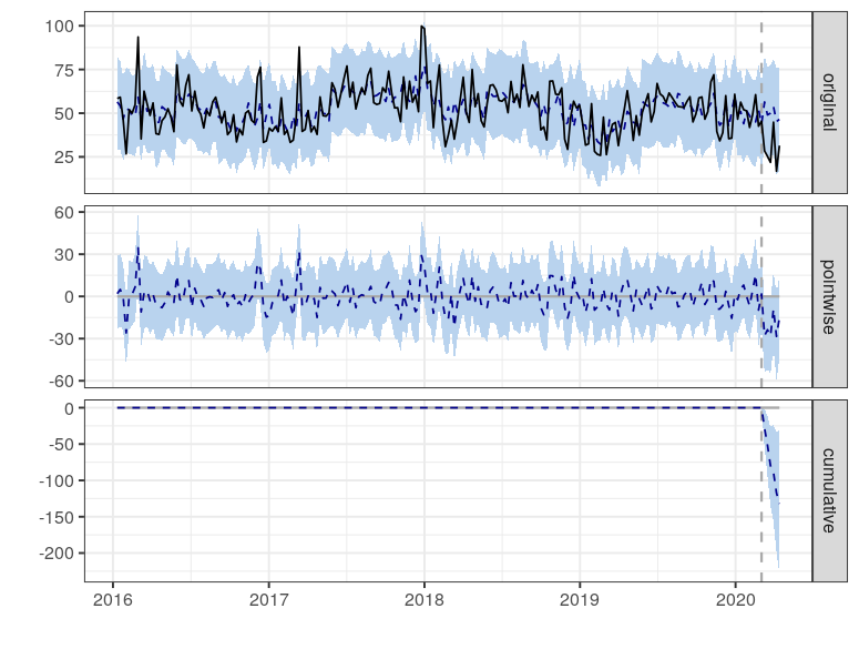
The plot has 3 sub-plots which can be characterised by:
- The first panel shows the data (solid line) and a counterfactual prediction (dash line) for the post-intervention period. The pale blue regions represent the posterior intervals.
- The second panel shows the difference between observed data and counterfactual predictions. This represents the pointwise causal effect.
- The third panel adds up the pointwise contributions from the second panel, resulting in a plot of the cumulative effect of the intervention.
Visually, we see that the pointwise estimate has shown a large degree of shift that seems significant. At the same time, the blue shaded regions help us visualise the uncertainty about our estimates. Given that the alpha was at 0.05, we are looking at the 95% posterior interval. In the immediate period after the intervention, we see that the PM2.5 air quality experienced a sharp reduction that is considered significantly different. After about a month, the PM2.5 show some partial extent of recovery, but remain largely deviated from its normal value.
We can also extract out the summary of the CausalImpact object.
summary(impact)
Posterior inference {CausalImpact}

                         Average        Cumulative
Actual                   28             169
Prediction (s.d.)        50 (8.6)       301 (51.7)
95% CI                   [33, 66]       [199, 398]

Absolute effect (s.d.)   -22 (8.6)      -132 (51.7)
95% CI                   [-38, -5]      [-229, -30]

Relative effect (s.d.)   -44% (17%)     -44% (17%)
95% CI                   [-76%, -10%]   [-76%, -10%]

Posterior tail-area probability p:   0.006
Posterior prob. of a causal effect:  99.4%

For more details, type: summary(impact, "report")
The “Average” column represents the average across time during the post-intervention period, while the “Cumulative” column presents the total sum of the time points. In particular, looking at the Average Absolute effect, we see that it is estimated to be 22, with a 95% posterior interval between -38 to -5. Since the interval excludes 0, we can conclude that the intervention of the Public Health Emergency in Los Angeles had a causal impact on the PM2.5 air quality with certain assumptions.
For a further look at the report, we can run the following code which generates a template report that is populated with the analysis data.
summary(impact, "report")
Analysis report {CausalImpact}


During the post-intervention period, the response variable had an average value of approx. 28.11. By contrast, in the absence of an intervention, we would have expected an average response of 50.15. The 95% interval of this counterfactual prediction is [33.14, 66.30]. Subtracting this prediction from the observed response yields an estimate of the causal effect the intervention had on the response variable. This effect is -22.04 with a 95% interval of [-38.20, -5.03]. For a discussion of the significance of this effect, see below.

Summing up the individual data points during the post-intervention period (which can only sometimes be meaningfully interpreted), the response variable had an overall value of 168.63. By contrast, had the intervention not taken place, we would have expected a sum of 300.90. The 95% interval of this prediction is [198.82, 397.81].

The above results are given in terms of absolute numbers. In relative terms, the response variable showed a decrease of -44%. The 95% interval of this percentage is [-76%, -10%].

This means that the negative effect observed during the intervention period is statistically significant. If the experimenter had expected a positive effect, it is recommended to double-check whether anomalies in the control variables may have caused an overly optimistic expectation of what should have happened in the response variable in the absence of the intervention.

The probability of obtaining this effect by chance is very small (Bayesian one-sided tail-area probability p = 0.006). This means the causal effect can be considered statistically significant.
Limitations
One major limitation of this analysis is that there needs to be strong assumptions about the flow of causality. Based on my understanding of what happened with Covid-19, my postulation is that the intervention of public health emergency rendered a drastic reduction in human movement traffic and economic activity. This resulted in lesser energy consumed, which brought about a reduction of PM2.5 air particles in Los Angeles. Thus, this analysis is only true with the assumptions that there are no other confounding factors that may have affected PM2.5 data.
Another limitation is that the model can be further improved if we have exogenous data that could help improve the prediction of the counterfactual baseline. If we had such data, the uncertainty measured by the model would have been reduced greatly, which would enable us to detect any corresponding signals from the intervention more easily. As mentioned previously, the effects of the public health emergency and its measures are so prevalent that it is difficult to find an instrument variable that was not affected by the intervention.
Summary
This article has been an interesting side-project for me to learn how to apply causal analysis in terms of time series. It was very interesting to learn more about how to use the combination of structural time series and causal analysis effectively.
Using that causal analysis framework and some postulation on the causal mechanism, I was able to show that the impact of a public health emergency due to Covid-19 in Los Angeles caused a reduction in PM 2.5 air, thereby improving the air quality (with some assumptions that there are no other confounders).
For a reference on the code, you can find it in this project Github. More specifically, the R code can be found in this R script.